16th May 2014
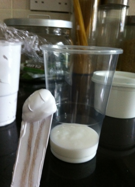
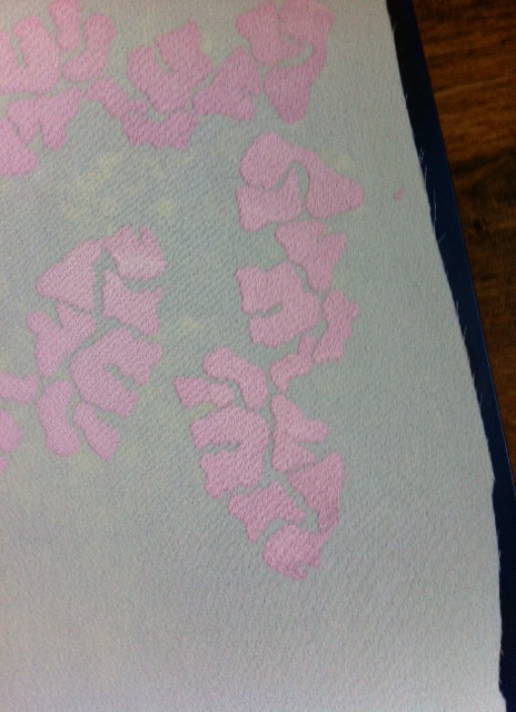
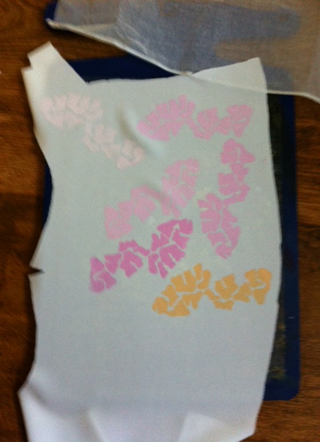
Today I spent the entire day relentlessly printing to find a tone in my four colour palate colours that I was happy with. With all of the printing I did yesterday, I was able to work out roughly how much binder, ink and white ink I would need to mix to get a tone I would be happy with. This time rather than printing on individual pieces of fabric, I decided that it would work in my favour to keep all of the prints on one piece of fabric so that I could evaluate the tones side by side. After several prints, I started to feel like I may lose track of what print was done first, so taking a picture after every print helped me to remember which tone was printed first. Sticking my fingers into the shot also played a helpful part in my decision-making. Once I printed a shade I was happy to use as my final tone, I carried on printing testing in a different colour and so on
The disadvantage of keeping the prints on one piece of fact was the fact that I started to like all of the different tones in one colour on the fabric. I found myself considering whether or not I wanted to stick to one colour for my final print but in different tone? a mixture of lighter and darker tones? Maybe this is something I could consider for future projects.


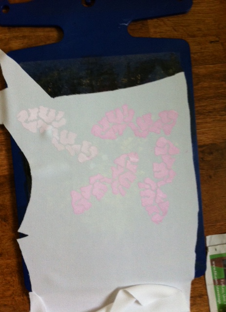
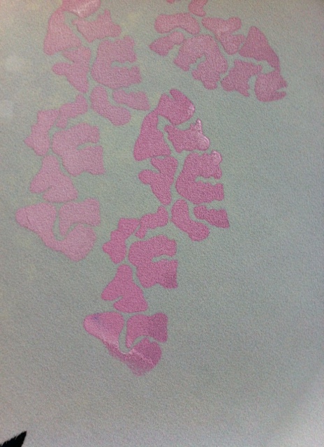

The final pink tone I printed here was the one I was most please with so I moved on to testing the orange.
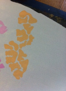
Fortunately I was happy enough with my full pull of my orange ink because I felt the tone was pretty similar to my tone of pink
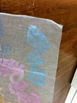
I liked this shade of blue but I felt it was a bit too bright, so I decided to add a bit more binder to the ink and what I added was enough to tone the blue print down a bit. Getting the shade right will mean that I will also achieve a soft translucent aesthetic.

Much happier with this paler shade of blue. This will be the final shade of blue for my final printed garments
Still not happy with this shade of yellow. It is too bright. I don’t want this print yellow print to be the first thing you notice when looking at my final garment. I will try again until I am happy with lighter yellow shade or I will not print yellow at all on the final garment


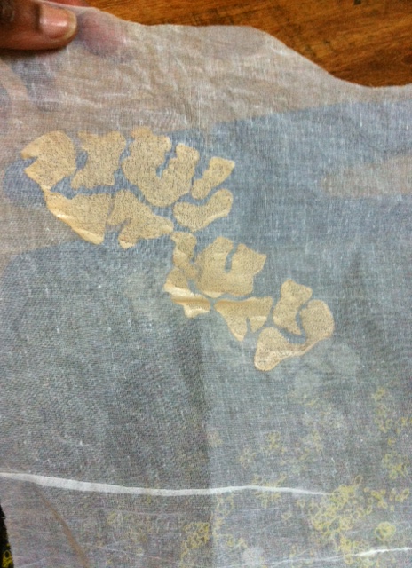
Here I tested my colour pallet on a piece of cotton organdie that I intend on using to cut my butterfly wings patterns. I learnt that although I was using the exact same batch of inks that I used to print onto the polyester crepe, the print looks a lot lighter which I presume is down to the transparency of the cotton organdie? I strongly feel this may be the case. When I hold the cotton organdie up against my white fridge, then the printers looks brighter. I am now confident that my print design and colour pallet is perfect for printing onto a light canvas (my ivory fabrics for my FMP collection)

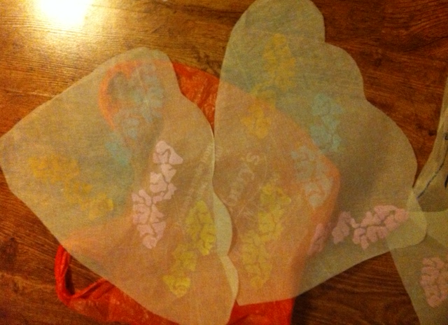
I had already cut and prepared my cotton organdie wing shapes ready for my print design, so as soon as I made a decision on my colour tones, I started to print onto my final pieces of cotton organdie for the final garment. Now that I have made a decision on all of my tones, my next plan is to start printing on my jumpsuit bodice pieces so that when they are dry, I can start sewing my pieces together.
